MATTHEWHLU91@GMAIL.COM
Actively seeking Product Design opportunities, I would be thrilled to discuss my work if it piques your interest
Get in touch!
Design is an ongoing process..and there is always room for improvement. With the results of usability testing, it gives me the opportunity to make improvements to the product.
The User
USER PERSONAS
Created after summarizing the results from primary and secondary research.
Meet Amelie, Liana, and Andrew.


Research…is needed for great user experience design. I felt like user interviews was not going to give me enough data that I wanted. Given the topic at hand, I decided to use a survey to gather information for my project.
USER INTERVIEWS VS. USER SURVEYS
User interviews are the gold standard when it comes to user research. However given the topic of food, I felt the data received from user interviews for this particular project wouldn’t be enough. I wanted confirm my assumptions and wanted to prioritize quantitative data over qualitative. Food is a subject with a wide range of diets, eating habits and preferences. I wanted to account for all of those. Simply interviewing 5-8 users would not be enough data for this subject
User Research
USER SURVEY
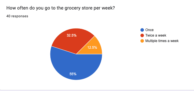
After creating a survey using Google Forms, I sent it out on various outlets (Discord, instagram, and Group Critiques). I received a total of 40 responses.
KEY TAKEAWAYS
Common pain points with cooking for users are deciding what to eat, time spent cooking, and not planning far enough throughout the week for meals
Users were open to the idea of someone picking out recipes for them to try.
Must consider diet and food preferences.
Meal planning services were also considered in the survey.
Hello Fresh, Blue Apron and Freshly were mentioned. They were convenient but the recipes became repetitive for users and the service got expensive.


About the project…Cooking is therapeutic to some and a chore to others. Eating out can be expensive and ordering delivery can be costly as well. Cooking can be such a process from figuring out what to eat, gathering ingredients and cooking.


It’s time for me to jump into the realm of mobile applications. The question is what kind of application? I decided to create one around one of my favorite things in the world: Food.
My role: UX/UI Designer and Researcher
Timeline: 80 Hours/4 weeks

The problem… with cooking is figuring out what to make each week, forming a grocery list, and going to the grocery store. Some users do not buy enough or plan far enough in advance for the week. This leads to more trips to the grocery store than intended.

My solution…to some pain points with cooking is an app that allows users to discover new recipes, generate a menu with recipes for the week (or longer) and compile a grocery list based on those recipes. This would hopefully reduce the stress in meal planning and assist in decreasing the number of trips to the grocery store.
What's out there..
COMPETITIVE ANALYSIS


Tasty is more of an indirect competitor to my idea.
It offers plenty of recipes and the ability to generate a grocery list based on added recipes.
The grocery list function is quite limited; a user is not able to add any items that don’t pertain to their recipe.
No meal planning feature.
Yummly has an onboarding quiz to help curate recipes for users, which was a feature I enjoyed. It takes into account allergies, diets, preferred food types, and foods that are disliked to avoid certain recipes.
However, a lot of features such as meal planning and grocery list formation are part of their premium service.
Mealime Meal Planner has a great onboarding quiz to help curate how many meals to plan for the week.
It is limited to planning out a week in advance.
Food Network Kitchen, Yummly and Mealime Meal Planner are all direct competitors to my idea.
All three have extensive recipes and a meal planner feature in their application. The similarity in the meal planner feature across all three apps is that they are manual and users have to add their own recipes to meal plans.
The development…begins with prioritizing with a project road map, creating user flows and task flows to map our design and then on to low fidelity, mid fidelity and high fidelity screens.
The journey… begins with project roadmapping and prioritizing what is needed for a minimal viable product.
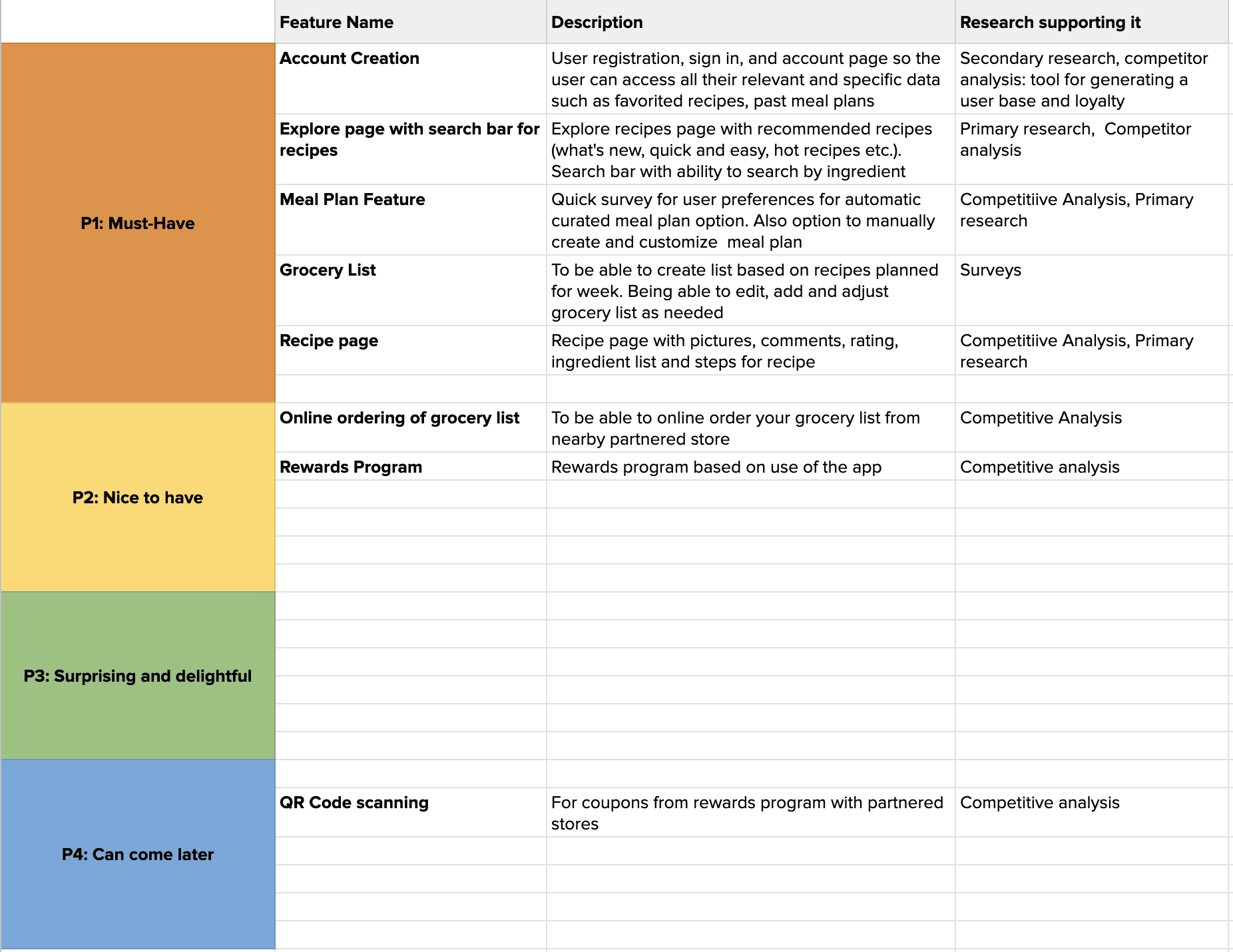
After prioritizing what features were absolutely needed, we go on to the user journey through user flows with all possible interactions the user may have with the application.
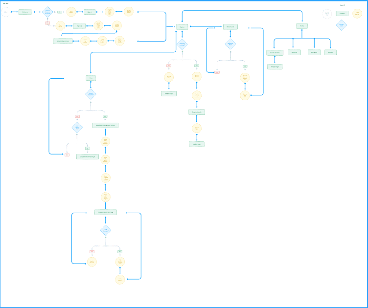
The user flows are then broken down into simpler task flows.

After the initial sketching and planning, we move towards digitizing our sketching and fleshing out more in depth wireframes.


After much brainstorming… these would be the elements that my high fidelity wireframes will be built upon. I drew some inspiration from one of my favorite Youtube channels, Bon Appetit. I like the simple, modern look. In terms of color, I don’t like the idea of red or yellow for my food application, although they symbolize food. I went with a green instead. Being a huge fan of the TV show The Bear, it was only appropriate for me to name my app….Yes, Chef!
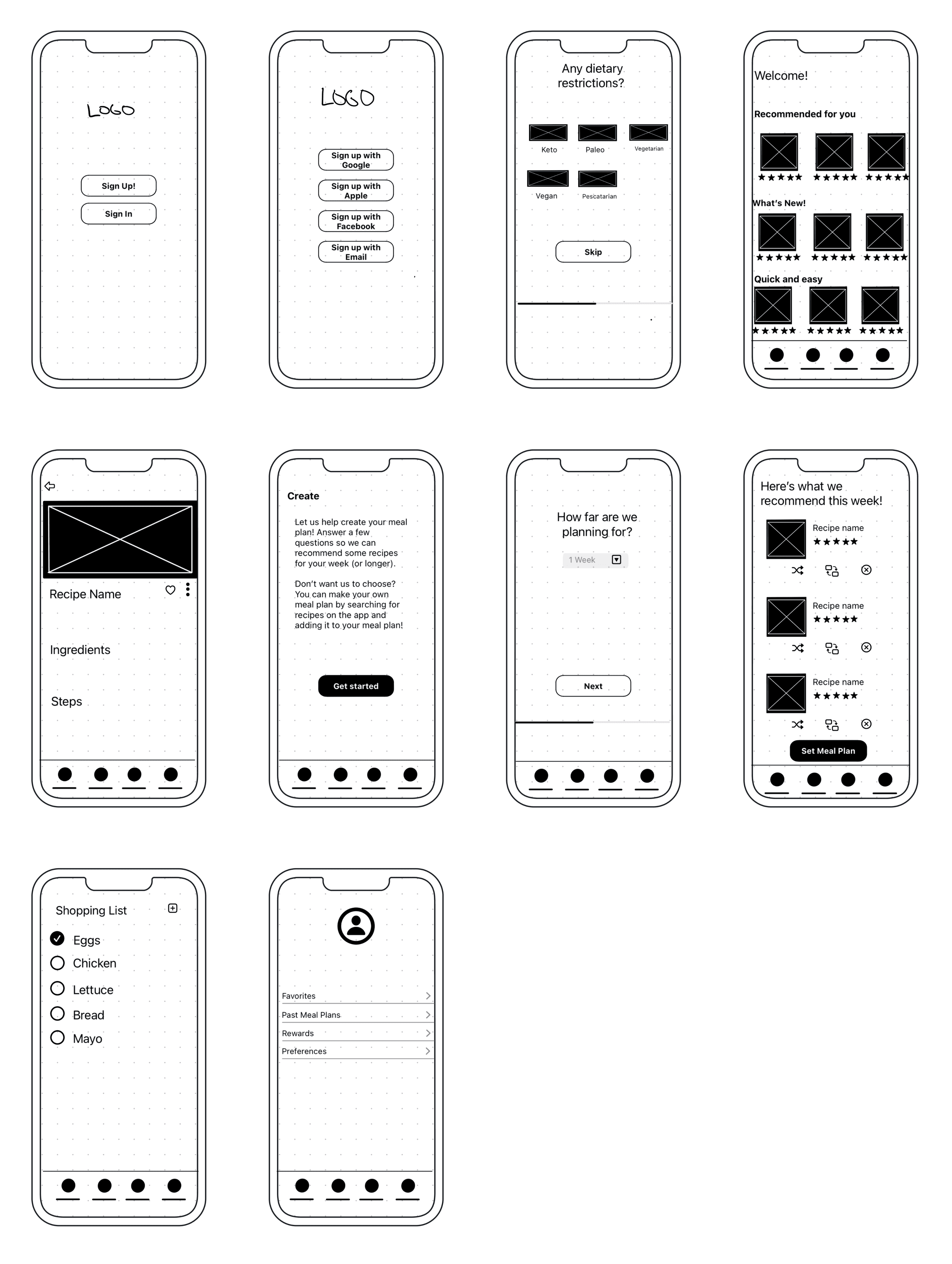
The process…starts with sketching key screens for the application using: Mock Up on IOS.
The High Fidelity Prototype…included the four task flows I wanted to test in usability testing. The screens below consisted of: signing up and completing the onboarding questionnaire, creating a meal plan through questionnaire and recipe recommendations, browsing recipes and replacing a meal on created meal plan, and finally adding ingredients to shopping list based on your meal plan.


Task Flow 1 - Signing up and completing onboarding questionnaire
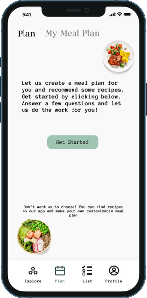

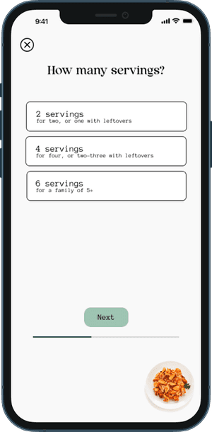
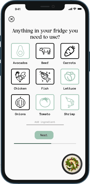
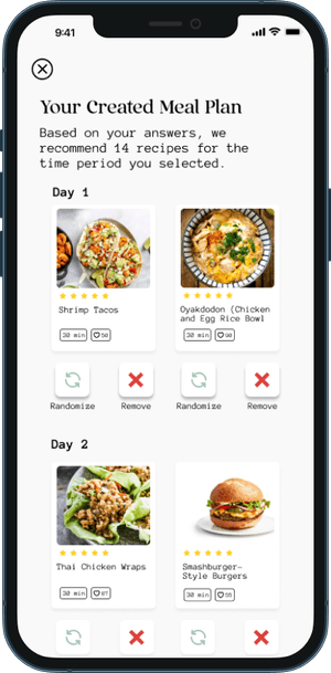

Task Flow 2 - Creating a meal plan through questionnaire and recipe recommendations


Task Flow 3 - Browse Recipes and Replace Meal on Meal Plan
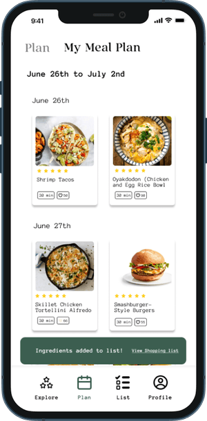
Task Flow 4 - Add ingredients from meal plan to Grocery List
Usability testing…It’s finally time to test the fruit of your labor. This testing allows me to get valuable feedback from users to improve my product.

Testing Details
USABILITY TESTING
Type:
Remote and Moderated
5 Participants between the ages of 28-35
4 Male; 1 Female
Tasks to be tested:
Task Flow 1: Signing up and Completing Onboarding Questionnaire
Task Flow 2: Creating a meal plan through questionnaire and recommended recipes
Task Flow 3: Browse Recipes and Replace Meal on created meal plan
Task Flow 4: Add ingredients from created meal plan to shopping list
Success Metrics
80% of participants are able to complete all tasks
Participants are able to complete each task within 5 mins
80% of participants are able to complete all tasks without error
In terms of success metrics, usability testing went very well and the design was success. However, there were a few recommendations provided by the users to help improve the product.
1 user suggested to make fonts and text more uniform on onboarding survey. Some items had hyphens and some didn’t. The verbiage on the add disliked foods field should match the question.
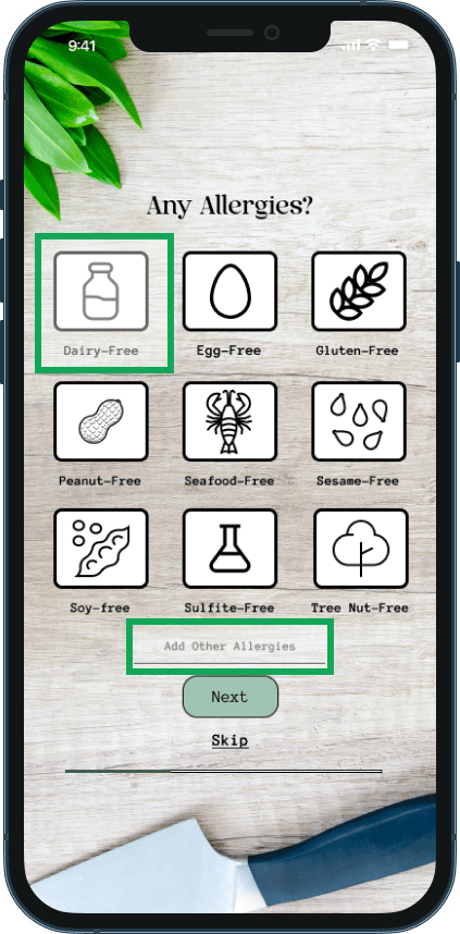
1 user suggested to add an “Add Additional Allergies” field to insert allergies that aren’t listed
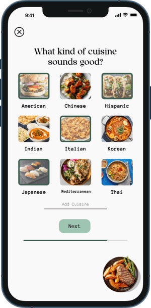
On the cuisines page in meal plan creation, the selected cuisines should be more notable to show that they are currently selected.
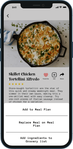
Replace menu button and make actions on recipe page more obvious.
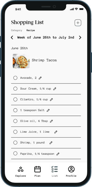
4/5 users suggested to move add ingredients button to the same screen instead of having to scroll down the screen.
1 users suggested to have the option to add ingredients to shopping list from the recipe page as well.
2/5 users recommended to increase the font size on the shopping list screens.
The outcome
USABILITY TESTING RESULTS
100% of users were able to complete all 4 tasks.
Users were able to complete all tasks within 12 mins.
100% of Users were able to complete all tasks without error.
Design is an ongoing process..and there is always room for improvement. With the results of usability testing, it gives me the opportunity to make improvements to the product.
AFTER
Font size made to be more uniform with the rest.
Add other allergies field has been placed.
Round Two
ITERATIONS

BEFORE
One user stated the text on this screen was inconsistent and should be more uniform.
Another user stated a field for additional allergies should be placed for allergies that aren’t listed.
BEFORE
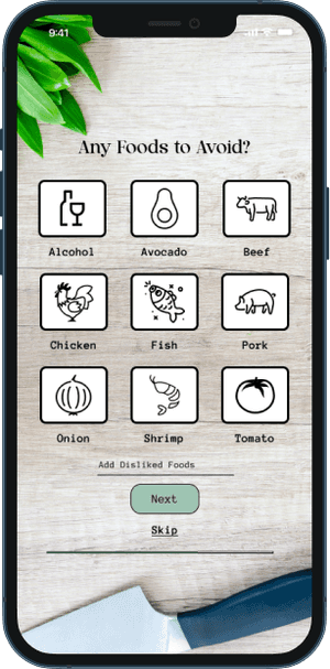
One user pointed out that it would be better if Add disliked foods to be changed to Add Additional Foods to Avoid to be more uniform.

BEFORE
One user suggested that the drop down menu on this screen should be changed to look like other selections on the following screens so the design could be consistent

AFTER
Drop down menu was removed and selections were made to look like following questions for consistency.
BEFORE
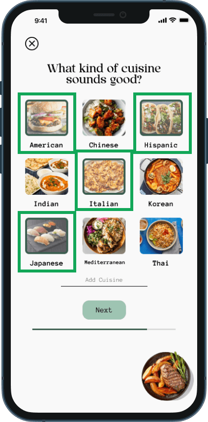
One user had difficulty telling if the option he had chosen was selected. The selected state wasn’t as apparent as it needed to be.
AFTER
Selected states were changed to be more noticeable. The outline was changed to a darker color and picture lightened to show it was selected.
BEFORE
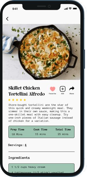
Users had difficulty figuring out where to go to add the recipe to their meal plan. The menu icon wasn’t as obvious to show there were more options.

BEFORE
One user stated that there should be an option to add ingredients to the grocery list from the recipe page.
AFTER
After the changes to the menu icon, the share recipe option was changed to “Add ingredients to Grocery List”


BEFORE
Users stated that the font on the shopping list was too small.

AFTER
Font size was increased to improve readability.

AFTER
“Add Disliked Foods” changed to “Additional Foods to Avoid” to be more uniform.
AFTER
Menu icon was replaced with three separate icons for actions available for ease of the user.

BEFORE
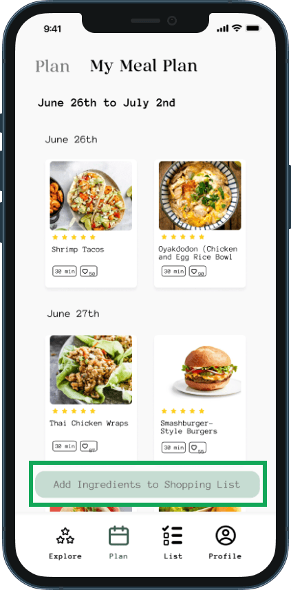
Users suggested that having the add ingredients button within the same screen would be much easier than scrolling all the way down to add.
AFTER
Add ingredients button moved to be fixed at the bottom of the screen.
Thank you… for making it this far into my case study. This is my final product and design after research, development, and usability testing.


FINAL THOUGHTS
I really enjoyed designing my first end to end application. I’m hoping this application will solve a daily question that everyone faces: “What do you feel like eating today?”. The biggest challenge I had with this project was the method chosen to collect the research. I figured surveys would be a quick way to get enough data and results especially with the relatable topic of food and cooking. However, the survey needed to ask all the right questions. A conversation with my mentor allowed me to fill in the gaps of my research. I had to revise the survey to include additional important questions. User interviews remain one of the better ways to collect user data. With this project, I have gotten more practice with research and experience in designing end to end applications. Again no project is truly finished and I hope I can continue further improving this product in the future.
It’s time for me to jump into the realm of mobile applications. The question is what kind of application? I decided to create one around one of my favorite things in the world: Food.
My role: UX/UI Designer and Researcher
Timeline: 80 Hours/4 weeks
It’s time for me to jump into the realm of mobile applications. The question is what kind of application? I decided to create one around one of my favorite things in the world: Food.
My role: UX/UI Designer and Researcher
Timeline: 80 Hours/4 weeks
About the project…Cooking is therapeutic to some and a chore to others. Eating out can be expensive and ordering delivery can be costly as well. Cooking can be such a process from figuring out what to eat, gathering ingredients and cooking.
About the project…Cooking is therapeutic to some and a chore to others. Eating out can be expensive and ordering delivery can be costly as well. Cooking can be such a process from figuring out what to eat, gathering ingredients and cooking.
The problem… with cooking is figuring out what to make each week, forming a grocery list, and going to the grocery store. Some users do not buy enough or plan far enough in advance for the week. This leads to more trips to the grocery store than intended.
The problem… with cooking is figuring out what to make each week, forming a grocery list, and going to the grocery store. Some users do not buy enough or plan far enough in advance for the week. This leads to more trips to the grocery store than intended.
Research…is needed for great user experience design. I felt like user interviews was not going to give me enough data that I wanted. Given the topic at hand, I decided to use a survey to gather information for my project.
Research…is needed for great user experience design. I felt like user interviews was not going to give me enough data that I wanted. Given the topic at hand, I decided to use a survey to gather information for my project.
USER INTERVIEWS VS. USER SURVEYS
USER INTERVIEWS VS. USER SURVEYS
User interviews are the gold standard when it comes to user research. However given the topic of food, I felt the data received from user interviews for this particular project wouldn’t be enough. I wanted confirm my assumptions and wanted to prioritize quantitative data over qualitative. Food is a subject with a wide range of diets, eating habits and preferences. I wanted to account for all of those. Simply interviewing 5-8 users would not be enough data for this subject
User interviews are the gold standard when it comes to user research. However given the topic of food, I felt the data received from user interviews for this particular project wouldn’t be enough. I wanted confirm my assumptions and wanted to prioritize quantitative data over qualitative. Food is a subject with a wide range of diets, eating habits and preferences. I wanted to account for all of those. Simply interviewing 5-8 users would not be enough data for this subject
User Research
USER SURVEY
After creating a survey using Google Forms, I sent it out on various outlets (Discord, instagram, and Group Critiques). I received a total of 40 responses.
After creating a survey using Google Forms, I sent it out on various outlets (Discord, instagram, and Group Critiques). I received a total of 40 responses.
KEY TAKEAWAYS
Common pain points with cooking for users are deciding what to eat, time spent cooking, and not planning far enough throughout the week for meals
Common pain points with cooking for users are deciding what to eat, time spent cooking, and not planning far enough throughout the week for meals
Users were open to the idea of someone picking out recipes for them to try.
Must consider diet and food preferences.
Users were open to the idea of someone picking out recipes for them to try.
Must consider diet and food preferences.
Meal planning services were also considered in the survey.
Hello Fresh, Blue Apron and Freshly were mentioned. They were convenient but the recipes became repetitive for users and the service got expensive.
Meal planning services were also considered in the survey.
Hello Fresh, Blue Apron and Freshly were mentioned. They were convenient but the recipes became repetitive for users and the service got expensive.
My solution…to some pain points with cooking is an app that allows users to discover new recipes, generate a menu with recipes for the week (or longer) and compile a grocery list based on those recipes. This would hopefully reduce the stress in meal planning and assist in decreasing the number of trips to the grocery store.
My solution…to some pain points with cooking is an app that allows users to discover new recipes, generate a menu with recipes for the week (or longer) and compile a grocery list based on those recipes. This would hopefully reduce the stress in meal planning and assist in decreasing the number of trips to the grocery store.
What's out there..
COMPETITIVE ANALYSIS
Food Network Kitchen, Yummly and Mealime Meal Planner are all direct competitors to my idea.
All three have extensive recipes and a meal planner feature in their application. The similarity in the meal planner feature across all three apps is that they are manual and users have to add their own recipes to meal plans.
Mealime Meal Planner has a great onboarding quiz to help curate how many meals to plan for the week.
It is limited to planning out a week in advance.
Mealime Meal Planner has a great onboarding quiz to help curate how many meals to plan for the week.
It is limited to planning out a week in advance.
Yummly has an onboarding quiz to help curate recipes for users, which was a feature I enjoyed. It takes into account allergies, diets, preferred food types, and foods that are disliked to avoid certain recipes.
However, a lot of features such as meal planning and grocery list formation are part of their premium service.
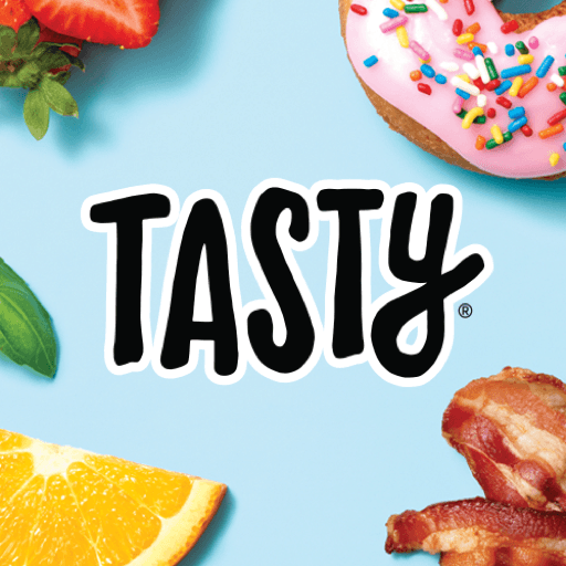
Tasty is more of an indirect competitor to my idea.
It offers plenty of recipes and the ability to generate a grocery list based on added recipes.
The grocery list function is quite limited; a user is not able to add any items that don’t pertain to their recipe.
No meal planning feature.
Tasty is more of an indirect competitor to my idea.
It offers plenty of recipes and the ability to generate a grocery list based on added recipes.
The grocery list function is quite limited; a user is not able to add any items that don’t pertain to their recipe.
No meal planning feature.
The User
USER PERSONAS
Created after summarizing the results from primary and secondary research.
Meet Amelie, Liana, and Andrew.
Created after summarizing the results from primary and secondary research.
Meet Amelie, Liana, and Andrew.
The development…begins with prioritizing with a project road map, creating user flows and task flows to map our design and then on to low fidelity, mid fidelity and high fidelity screens.
The development…begins with prioritizing with a project road map, creating user flows and task flows to map our design and then on to low fidelity, mid fidelity and high fidelity screens.
The journey… begins with project roadmapping and prioritizing what is needed for a minimal viable product.
The journey… begins with project roadmapping and prioritizing what is needed for a minimal viable product.
After prioritizing what features were absolutely needed, we go on to the user journey through user flows with all possible interactions the user may have with the application.
After prioritizing what features were absolutely needed, we go on to the user journey through user flows with all possible interactions the user may have with the application.
The user flows are then broken down into simpler task flows.
The process…starts with sketching key screens for the application using: Mock Up on IOS.
The process…starts with sketching key screens for the application using: Mock Up on IOS.
After the initial sketching and planning, we move towards digitizing our sketching and fleshing out more in depth wireframes.
After the initial sketching and planning, we move towards digitizing our sketching and fleshing out more in depth wireframes.
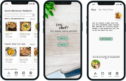
After much brainstorming… these would be the elements that my high fidelity wireframes will be built upon. I drew some inspiration from one of my favorite Youtube channels, Bon Appetit. I like the simple, modern look. In terms of color, I don’t like the idea of red or yellow for my food application, although they symbolize food. I went with a green instead. Being a huge fan of the TV show The Bear, it was only appropriate for me to name my app….Yes, Chef!
After much brainstorming… these would be the elements that my high fidelity wireframes will be built upon. I drew some inspiration from one of my favorite Youtube channels, Bon Appetit. I like the simple, modern look. In terms of color, I don’t like the idea of red or yellow for my food application, although they symbolize food. I went with a green instead. Being a huge fan of the TV show The Bear, it was only appropriate for me to name my app….Yes, Chef!
The High Fidelity Prototype…included the four task flows I wanted to test in usability testing. The screens below consisted of: signing up and completing the onboarding questionnaire, creating a meal plan through questionnaire and recipe recommendations, browsing recipes and replacing a meal on created meal plan, and finally adding ingredients to shopping list based on your meal plan.
The High Fidelity Prototype…included the four task flows I wanted to test in usability testing. The screens below consisted of: signing up and completing the onboarding questionnaire, creating a meal plan through questionnaire and recipe recommendations, browsing recipes and replacing a meal on created meal plan, and finally adding ingredients to shopping list based on your meal plan.
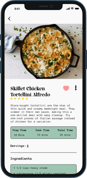
Task Flow 1 - Signing up and completing onboarding questionnaire
Task Flow 2 - Creating a meal plan through questionnaire and recipe recommendations
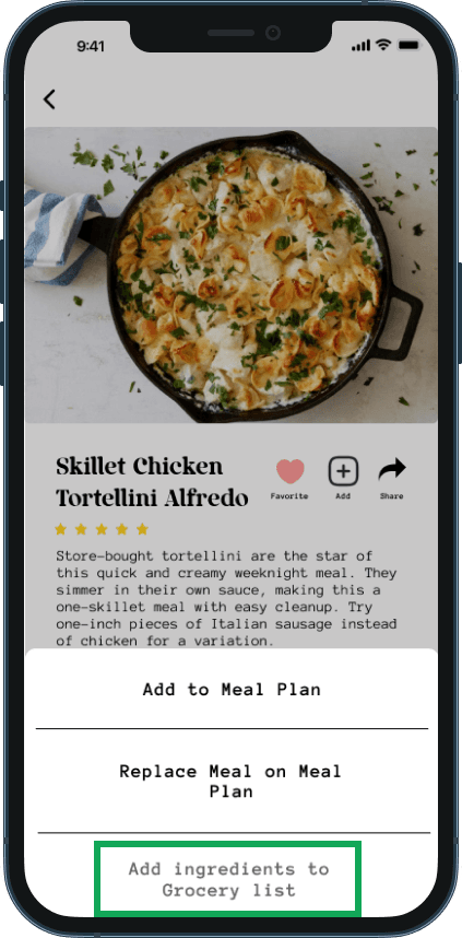
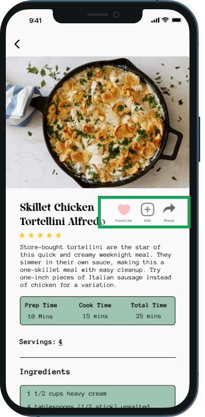
Task Flow 3 - Browse Recipes and Replace Meal on Meal Plan
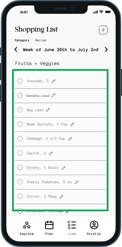
Task Flow 4 - Add ingredients from meal plan to Grocery List
Usability testing…It’s finally time to test the fruit of your labor. This testing allows me to get valuable feedback from users to improve my product.
Usability testing…It’s finally time to test the fruit of your labor. This testing allows me to get valuable feedback from users to improve my product.
Testing Details
USABILITY TESTING
Type:
Remote and Moderated
Type:
Remote and Moderated
5 Participants between the ages of 28-35
4 Male; 1 Female
5 Participants between the ages of 28-35
4 Male; 1 Female
Tasks to be tested:
Task Flow 1: Signing up and Completing Onboarding Questionnaire
Task Flow 2: Creating a meal plan through questionnaire and recommended recipes
Task Flow 3: Browse Recipes and Replace Meal on created meal plan
Task Flow 4: Add ingredients from created meal plan to shopping list
Tasks to be tested:
Task Flow 1: Signing up and Completing Onboarding Questionnaire
Task Flow 2: Creating a meal plan through questionnaire and recommended recipes
Task Flow 3: Browse Recipes and Replace Meal on created meal plan
Task Flow 4: Add ingredients from created meal plan to shopping list
Success Metrics
80% of participants are able to complete all tasks
Participants are able to complete each task within 5 mins
80% of participants are able to complete all tasks without error

In terms of success metrics, usability testing went very well and the design was success. However, there were a few recommendations provided by the users to help improve the product.
1 user suggested to make fonts and text more uniform on onboarding survey. Some items had hyphens and some didn’t. The verbiage on the add disliked foods field should match the question.
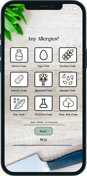
1 user suggested to add an “Add Additional Allergies” field to insert allergies that aren’t listed
On the cuisines page in meal plan creation, the selected cuisines should be more notable to show that they are currently selected.
Replace menu button and make actions on recipe page more obvious.
4/5 users suggested to move add ingredients button to the same screen instead of having to scroll down the screen.
1 users suggested to have the option to add ingredients to shopping list from the recipe page as well.
2/5 users recommended to increase the font size on the shopping list screens.
In terms of success metrics, usability testing went very well and the design was success. However, there were a few recommendations provided by the users to help improve the product.
1 user suggested to make fonts and text more uniform on onboarding survey. Some items had hyphens and some didn’t. The verbiage on the add disliked foods field should match the question.
1 user suggested to add an “Add Additional Allergies” field to insert allergies that aren’t listed
On the cuisines page in meal plan creation, the selected cuisines should be more notable to show that they are currently selected.
Replace menu button and make actions on recipe page more obvious.
4/5 users suggested to move add ingredients button to the same screen instead of having to scroll down the screen.
1 users suggested to have the option to add ingredients to shopping list from the recipe page as well.
2/5 users recommended to increase the font size on the shopping list screens.
The outcome
USABILITY TESTING RESULTS
100% of users were able to complete all 4 tasks.
Users were able to complete all tasks within 12 mins.
100% of Users were able to complete all tasks without error.
100% of users were able to complete all 4 tasks.
Users were able to complete all tasks within 12 mins.
100% of Users were able to complete all tasks without error.
Design is an ongoing process..and there is always room for improvement. With the results of usability testing, it gives me the opportunity to make improvements to the product.
Design is an ongoing process..and there is always room for improvement. With the results of usability testing, it gives me the opportunity to make improvements to the product.
AFTER
Font size made to be more uniform with the rest.
Add other allergies field has been placed.
Round Two
ITERATIONS
BEFORE
One user stated the text on this screen was inconsistent and should be more uniform.
Another user stated a field for additional allergies should be placed for allergies that aren’t listed.
BEFORE
BEFORE
One user pointed out that it would be better if Add disliked foods to be changed to Add Additional Foods to Avoid to be more uniform.
AFTER
AFTER
“Add Disliked Foods” changed to “Additional Foods to Avoid” to be more uniform.
BEFORE
BEFORE
One user suggested that the drop down menu on this screen should be changed to look like other selections on the following screens so the design could be consistent
AFTER
AFTER
Drop down menu was removed and selections were made to look like following questions for consistency.
BEFORE
BEFORE
One user had difficulty telling if the option he had chosen was selected. The selected state wasn’t as apparent as it needed to be.
AFTER
AFTER
Selected states were changed to be more noticeable. The outline was changed to a darker color and picture lightened to show it was selected.
BEFORE
BEFORE
Users had difficulty figuring out where to go to add the recipe to their meal plan. The menu icon wasn’t as obvious to show there were more options.
AFTER
AFTER
Menu icon was replaced with three separate icons for actions available for ease of the user.
BEFORE
BEFORE
One user stated that there should be an option to add ingredients to the grocery list from the recipe page.
AFTER
AFTER
After the changes to the menu icon, the share recipe option was changed to “Add ingredients to Grocery List”
BEFORE
BEFORE
Users suggested that having the add ingredients button within the same screen would be much easier than scrolling all the way down to add.
AFTER
AFTER
Add ingredients button moved to be fixed at the bottom of the screen.
BEFORE
BEFORE
Users stated that the font size on the shopping list was too small.
AFTER
AFTER
Font size was increased to improve readability.
Thank you… for making it this far into my case study. This is my final product and design after research, development, and usability testing.
Thank you… for making it this far into my case study. This is my final product and design after research, development, and usability testing.
FINAL THOUGHTS
