Thank you…for making it this far. This is my final product and design after research, development and usability testing with before and after designs.


BEFORE


AFTER
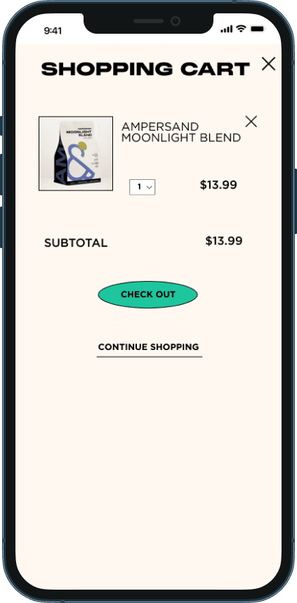
Task Flow 1: Preordering a Drink


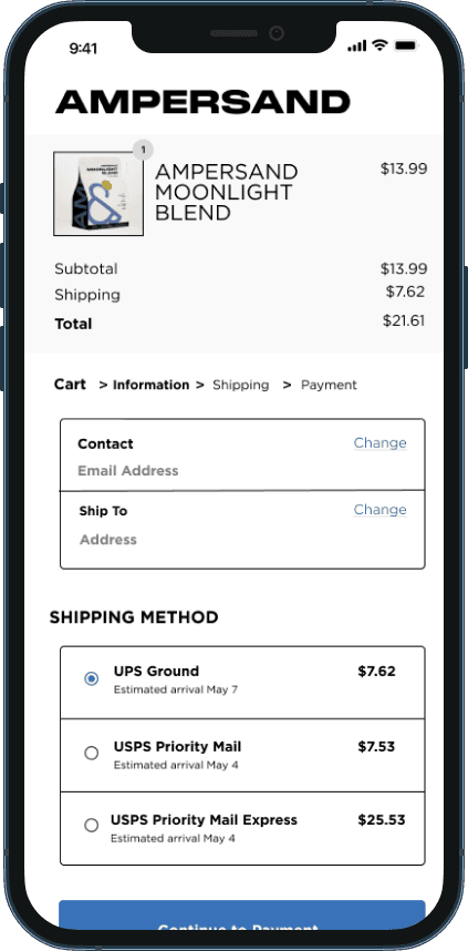


Task Flow 2: Ordering Merchandise
Design is an ongoing process.. and no project is truly complete. Luckily with the results of usability testing, there were no recommendations to the current tasks. However that does not mean that this product cannot be further improved in the future.
The High Fidelity Prototype… included the 2 task flows I wanted to test in usability testing. The screens below consisted of screens for Pre Ordering a Drink for Pick up and Ordering Merchandise Online.

The development…begins with a site map, creating user flows and task flows to map our design and then on to low fidelity, mid fidelity and high fidelity screens.

The User
USER PERSONAS
Created after summarizing the results from primary and secondary research.
Meet Arturo and Mary.

What's out there..
COMPETITIVE ANALYSIS


Alfred’s, Starbucks, and Happy Lemon have great systems in place for online ordering with many customizations available.
Pictures are included with each menu item as well.
Casa Azul has an online ordering function on their website but the menu is lacking pictures and there aren’t customization options available when placing an order.
Each has a login/sign up function to log previous orders and keep track of payment methods.
Alfred’s and Starbucks both sell beans and merchandise.
Starbucks combines merchandise along with their drink ordering system.
Alfred’s separates drinks and merchandise ordering.
Alfred’s is the only website that includes events and collabs.
Since Alfred’s is a chain there is no mention of local events but they do list previous collaborations
Overall, I felt that the content as well as the look and feel of Alfred’s was one I resonated with the most
The solution…I plan to redesign Ampersand’s website with improvements to online sales such as online ordering for drinks and redesigning their merchandise shop to increase sales. The goal is to bring a whole new look and feel to the website itself so customers would want to visit the website instead of only scrolling social media.

The challenge…with plans to expand their business and increase their sales, they wanted to do a redesign of their website to paint their brand with an improvement on their e-commerce side as well. They wanted to improve the experience of shopping for merchandise and coffee beans as well as create an online ordering function for drinks. They also wanted to promote upcoming and current events happening at their shop.
On to my first real project! Enter the realm of responsive website design. I’ve been thinking about this project for a long time and I finally had the opportunity to work with. Ampersand TX
My Role: UX Designer and Researcher
Branding: Doing Good Studios
Timeline: 80 Hours/4 weeks
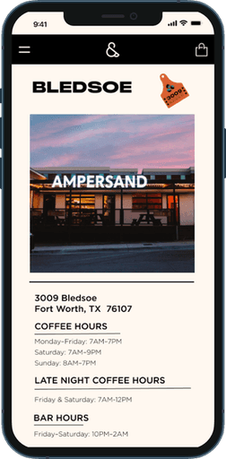
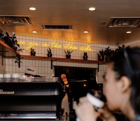
About the company… Ampersand TX is a coffee shop by day and nightclub by night opened in Fort Worth, Texas in 2017. They proudly serve their community with coffee, tea and other drinks during the day and on weekends open as a nightclub at night. They opened their second location on the Texas Christian University Campus in 2018 which strictly operates as a coffee shop for university students nearby.

Ampersand Bledsoe Location
Club by night
Coffee shop by day
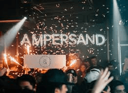
Club by night
Research…is needed for great user experience design. I wanted to interview current customers of Ampersand to get a better idea of how to redesign their website. The challenge was it was difficult finding current customers to interview so I enlisted the help of my stakeholders. The stakeholders stated that customers were more agreeable in filling out a survey vs. participating in user interviews.
User Research
USER SURVEY
Over a week’s time with the help of the stakeholders, I had sent out two surveys and received:
10 Survey Responses from current customers.
10 Secondary Survey and Instagram poll responses for what company/coffee shop gave users the best experience.
KEY TAKEAWAYS
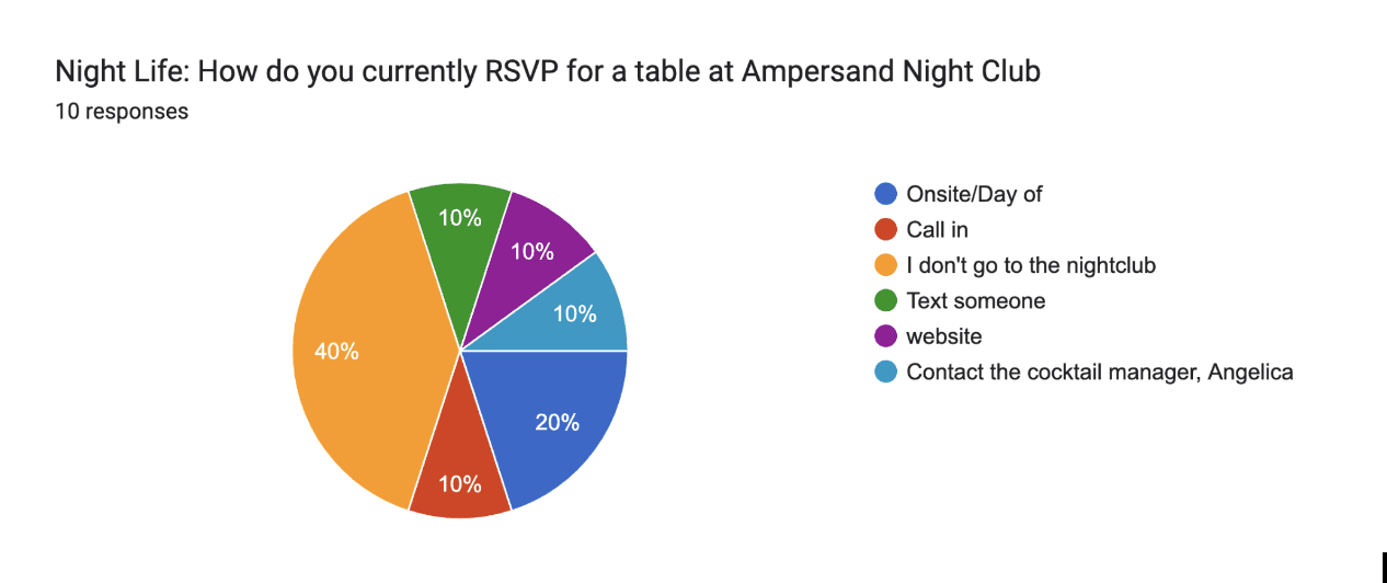
Each customer had a different way of RSVPing a table.
Majority of Customers who go to the nightclub (44%) rated the current process 5/10.
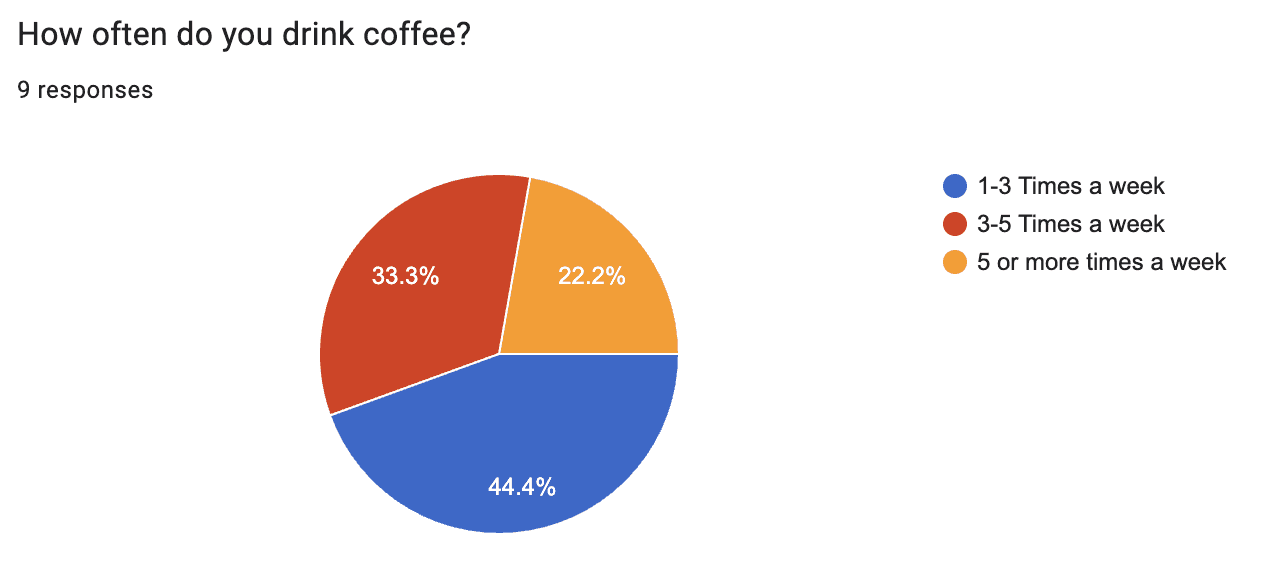
4 Users stated they had used mobile ordering in the past to place orders for drinks at other coffee shops.
Majority of users stated having a positive experience using Starbucks’ mobile ordering service (8 out of 10 users mentioned Starbucks)
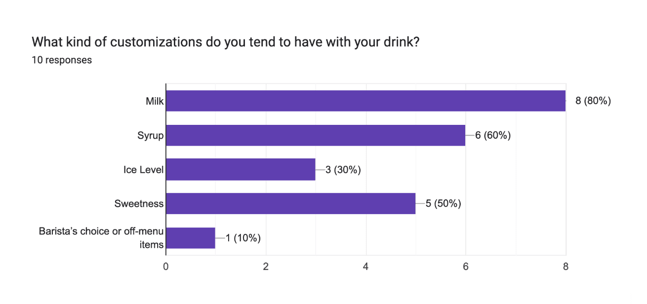
Majority of merchandise and beans are bought on location.
Majority of users find out about events and new menu items through their social media accounts.
Laying it out


SITE MAP
The journey… begins with a site map. Before I started any sketching, I needed to build a site map to determine what pages needed to be made and what the general layout of the website would look like.

Based on user research, I was able to map out all the ways my users would be able to navigate the redesigned website. This User flow serves as a road map which includes all the paths my user could take.

From the user flows, we are able to break it down into more simpler linear task flows.
After the initial sketching and planning, we move towards digitizing our sketching and fleshing out more in depth wireframes.
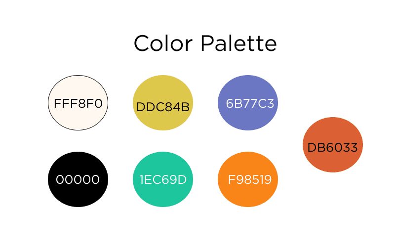
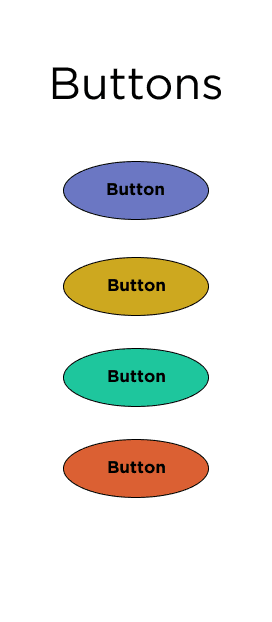
Based on the branding set by Doing Good Studios, these are the logos, typeface, and color palette to be used in this project

Testing Details
USABILITY TESTING
Type:
Remote and Moderated
Tasks to be tested:
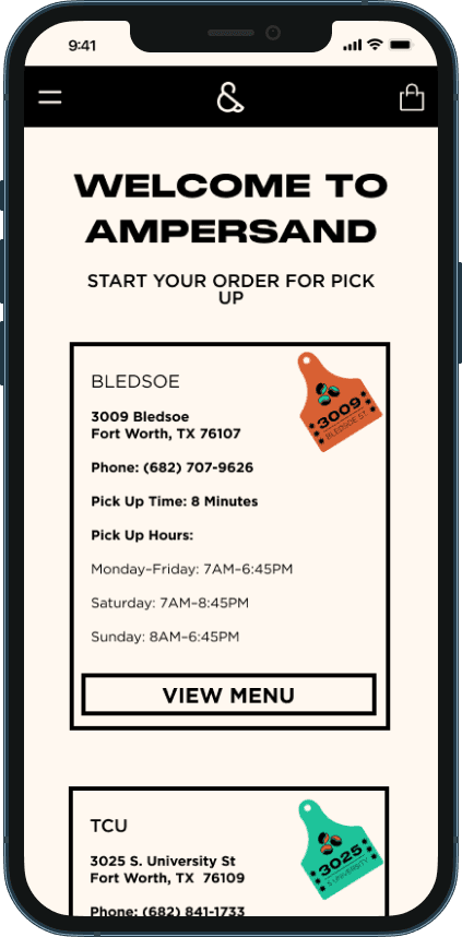
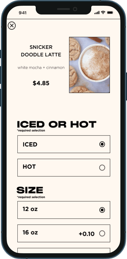
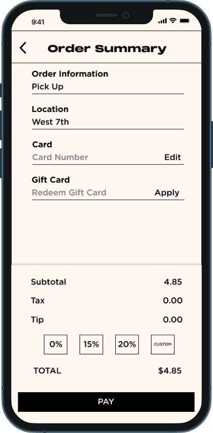
Task Flow 1: Pre Ordering a Drink for Pick up
Task Flow 2: Ordering Merchandise Online
5 Participants between the ages of 28-35
2 Male; 3 Female
Success Metrics:
80% of participants are able to complete both tasks
Participants are able to complete each task within 8 mins
80% of participants are able to complete both tasks without error

Task Flow 1: Preordering a drink

Task Flow 2: Ordering Merchandise
The Outcome
USABILITY TESTING RESULTS
All Users were able to complete both tasks in 4 mins.
100% of Users were able to complete both tasks.
All users thought that the task flows with preordering and purchasing merchandise were straight forward and very easy to go through.
Conclusion: All 5 users tested stated there were no recommendations for changes based on tasks tested.
FINAL THOUGHTS
This project has got to be one of my favorite projects so far early in my career as a UX designer. Ampersand TX is a company that has deep roots for me and it was an honor to redesign their website.
I was luckily able to work briefly with Doing Good Studios and learn more about their design process. I’m grateful that they were able to take me under their wing to give me feedback on my design. I enjoyed learning how to apply their branding into Ampersand.
With this project, I’ve learned and am still learning how to stay within the constraints of branding, working with a design team, and getting experience working with clients. One of my biggest challenges with this project would be during the research phase. It was difficult for me to find customers to interview. However with the help of my stakeholders, they were able to find participants that were agreeable to user surveys. My only wish was that I had more time to work on this project. 80 hours was simply not enough but with all projects, no project is truly finished. I have a feeling I’ll be coming back to this project sooner than later.


AMPERSAND
ampersandtx.com

AMPERSAND
AMPERSAND
ampersandtx.com
ampersandtx.com
On to my first real project! Enter the realm of responsive website design. I’ve been thinking about this project for a long time and I finally had the opportunity to work with. Ampersand TX
My Role: UX Designer and Researcher
Branding: Doing Good Studios
Timeline: 80 Hours/4 weeks
On to my first real project! Enter the realm of responsive website design. I’ve been thinking about this project for a long time and I finally had the opportunity to work with. Ampersand TX
My Role: UX Designer and Researcher
Branding: Doing Good Studios
Timeline: 80 Hours/4 weeks
About the company… Ampersand TX is a coffee shop by day and nightclub by night opened in Fort Worth, Texas in 2017. They proudly serve their community with coffee, tea and other drinks during the day and on weekends open as a nightclub at night. They opened their second location on the Texas Christian University Campus in 2018 which strictly operates as a coffee shop for university students nearby.
About the company… Ampersand TX is a coffee shop by day and nightclub by night opened in Fort Worth, Texas in 2017. They proudly serve their community with coffee, tea and other drinks during the day and on weekends open as a nightclub at night. They opened their second location on the Texas Christian University Campus in 2018 which strictly operates as a coffee shop for university students nearby.
Ampersand Bledsoe Location
Club by night
Coffee shop by day
The challenge…with plans to expand their business and increase their sales, they wanted to do a redesign of their website to paint their brand with an improvement on their e-commerce side as well. They wanted to improve the experience of shopping for merchandise and coffee beans as well as create an online ordering function for drinks. They also wanted to promote upcoming and current events happening at their shop.
The challenge…with plans to expand their business and increase their sales, they wanted to do a redesign of their website to paint their brand with an improvement on their e-commerce side as well. They wanted to improve the experience of shopping for merchandise and coffee beans as well as create an online ordering function for drinks. They also wanted to promote upcoming and current events happening at their shop.


Research…is needed for great user experience design. I wanted to interview current customers of Ampersand to get a better idea of how to redesign their website. The challenge was it was difficult finding current customers to interview so I enlisted the help of my stakeholders. The stakeholders stated that customers were more agreeable in filling out a survey vs. participating in user interviews.
Research…is needed for great user experience design. I wanted to interview current customers of Ampersand to get a better idea of how to redesign their website. The challenge was it was difficult finding current customers to interview so I enlisted the help of my stakeholders. The stakeholders stated that customers were more agreeable in filling out a survey vs. participating in user interviews.
User Research
User Research
USER SURVEY
USER SURVEY
Over a week’s time with the help of the stakeholders, I had sent out two surveys and received:
10 Survey Responses from current customers.
10 Secondary Survey and Instagram poll responses for what company/coffee shop gave users the best experience.
Over a week’s time with the help of the stakeholders, I had sent out two surveys and received:
10 Survey Responses from current customers.
10 Secondary Survey and Instagram poll responses for what company/coffee shop gave users the best experience.
KEY TAKEAWAYS
KEY TAKEAWAYS
4 Users stated they had used mobile ordering in the past to place orders for drinks at other coffee shops.
Majority of users stated having a positive experience using Starbucks’ mobile ordering service (8 out of 10 users mentioned Starbucks)
4 Users stated they had used mobile ordering in the past to place orders for drinks at other coffee shops.
Majority of users stated having a positive experience using Starbucks’ mobile ordering service (8 out of 10 users mentioned Starbucks)
Majority of merchandise and beans are bought on location.
Majority of users find out about events and new menu items through their social media accounts.
Majority of merchandise and beans are bought on location.
Majority of users find out about events and new menu items through their social media accounts.
Each customer had a different way of RSVPing a table.
Majority of Customers who go to the nightclub (44%) rated the current process 5/10.
Each customer had a different way of RSVPing a table.
Majority of Customers who go to the nightclub (44%) rated the current process 5/10.
The solution…I plan to redesign Ampersand’s website with improvements to online sales such as online ordering for drinks and redesigning their merchandise shop to increase sales. The goal is to bring a whole new look and feel to the website itself so customers would want to visit the website instead of only scrolling social media.
The solution…I plan to redesign Ampersand’s website with improvements to online sales such as online ordering for drinks and redesigning their merchandise shop to increase sales. The goal is to bring a whole new look and feel to the website itself so customers would want to visit the website instead of only scrolling social media.
What's out there..
COMPETITIVE ANALYSIS
Alfred’s, Starbucks, and Happy Lemon have great systems in place for online ordering with many customizations available.
Pictures are included with each menu item as well.
Casa Azul has an online ordering function on their website but the menu is lacking pictures and there aren’t customization options available when placing an order.
Each has a login/sign up function to log previous orders and keep track of payment methods.
Alfred’s and Starbucks both sell beans and merchandise.
Starbucks combines merchandise along with their drink ordering system.
Alfred’s separates drinks and merchandise ordering.
Alfred’s is the only website that includes events and collabs.
Since Alfred’s is a chain there is no mention of local events but they do list previous collaborations
Overall, I felt that the content as well as the look and feel of Alfred’s was one I resonated with the most
Overall, I felt that the content as well as the look and feel of Alfred’s was one I resonated with the most
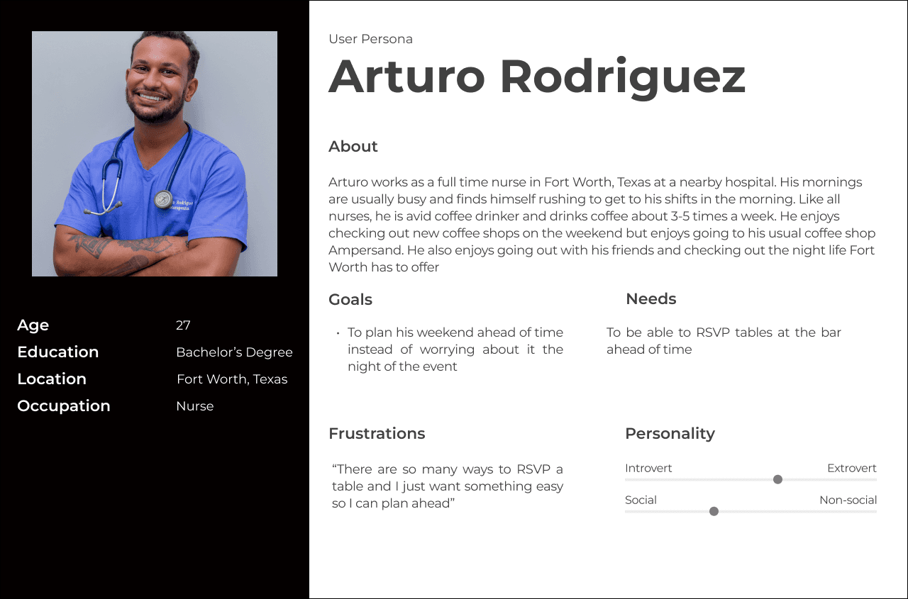
The User
USER PERSONAS
Created after summarizing the results from primary and secondary research.
Meet Arturo and Mary.
Created after summarizing the results from primary and secondary research.
Meet Arturo and Mary.
The development…begins with a site map, creating user flows and task flows to map our design and then on to low fidelity, mid fidelity and high fidelity screens.
The development…begins with a site map, creating user flows and task flows to map our design and then on to low fidelity, mid fidelity and high fidelity screens.
Laying it out
Laying it out
SITE MAP
SITE MAP
The journey… begins with a site map. Before I started any sketching, I needed to build a site map to determine what pages needed to be made and what the general layout of the website would look like.
The journey… begins with a site map. Before I started any sketching, I needed to build a site map to determine what pages needed to be made and what the general layout of the website would look like.
Based on user research, I was able to map out all the ways my users would be able to navigate the redesigned website. This User flow serves as a road map which includes all the paths my user could take.
Based on user research, I was able to map out all the ways my users would be able to navigate the redesigned website. This User flow serves as a road map which includes all the paths my user could take.
From the user flows, we are able to break it down into more simpler linear task flows.
From the user flows, we are able to break it down into more simpler linear task flows.
After the initial sketching and planning, we move towards digitizing our sketching and fleshing out more in depth wireframes.
After the initial sketching and planning, we move towards digitizing our sketching and fleshing out more in depth wireframes.
Based on the branding set by Doing Good Studios, these are the logos, typeface, and color palette to be used in this project
Based on the branding set by Doing Good Studios, these are the logos, typeface, and color palette to be used in this project
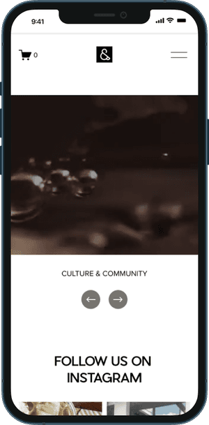
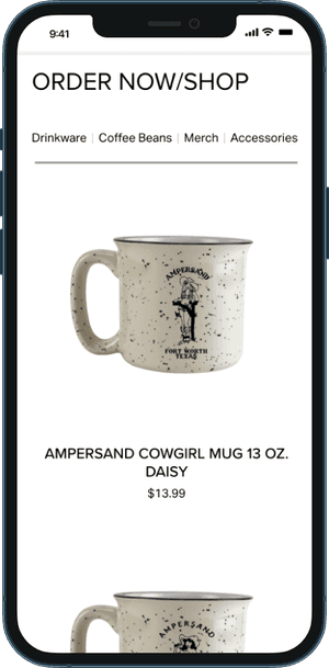
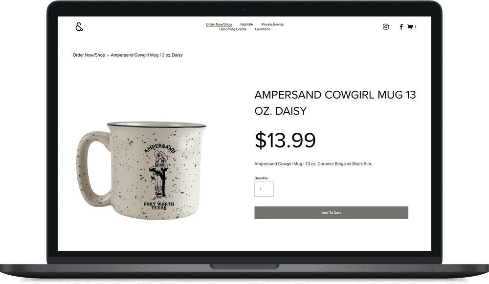
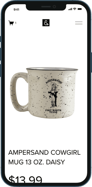
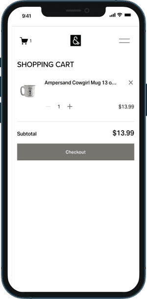
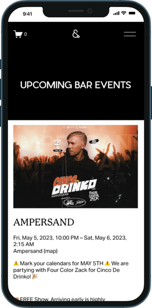
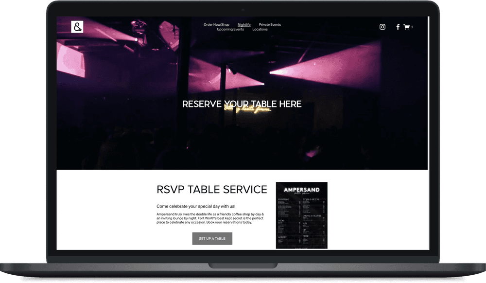
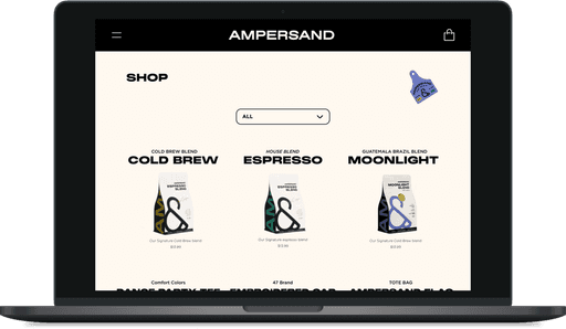
The High Fidelity Prototype… included the 2 task flows I wanted to test in usability testing. The screens below consisted of screens for Pre Ordering a Drink for Pick up and Ordering Merchandise Online.
The High Fidelity Prototype… included the 2 task flows I wanted to test in usability testing. The screens below consisted of screens for Pre Ordering a Drink for Pick up and Ordering Merchandise Online.
Task Flow 1: Preordering a Drink
Task Flow 2: Ordering Merchandise
Usability testing…Although this was a redesign, the stakeholders wanted to improve the look and feel of the e-commerce section of the website and look into an online preordering system for their menu items. Usability testing here is short and sweet and will test my design for those two tasks
Usability testing…Although this was a redesign, the stakeholders wanted to improve the look and feel of the e-commerce section of the website and look into an online preordering system for their menu items. Usability testing here is short and sweet and will test my design for those two tasks
Testing Details
USABILITY TESTING
Type:
Remote and Moderated
Type:
Remote and Moderated
Tasks to be tested:
Task Flow 1: Pre Ordering a Drink for Pick up
Task Flow 2: Ordering Merchandise Online
Tasks to be tested:
Task Flow 1: Pre Ordering a Drink for Pick up
Task Flow 2: Ordering Merchandise Online
5 Participants between the ages of 28-35
2 Male; 3 Female
5 Participants between the ages of 28-35
2 Male; 3 Female
Success Metrics:
80% of participants are able to complete both tasks
Participants are able to complete each task within 8 mins
80% of participants are able to complete both tasks without error
Success Metrics:
80% of participants are able to complete both tasks
Participants are able to complete each task within 8 mins
80% of participants are able to complete both tasks without error
Task Flow 1: Preordering a drink
Task Flow 2: Ordering Merchandise
The Outcome
The Outcome
USABILITY TESTING RESULTS
USABILITY TESTING RESULTS
All Users were able to complete both tasks in 4 mins.
All Users were able to complete both tasks in 4 mins.
100% of Users were able to complete both tasks.
100% of Users were able to complete both tasks.
All users thought that the task flows with preordering and purchasing merchandise were straight forward and very easy to go through.
All users thought that the task flows with preordering and purchasing merchandise were straight forward and very easy to go through.
Conclusion: All 5 users tested stated there were no recommendations for changes based on tasks tested.
Conclusion: All 5 users tested stated there were no recommendations for changes based on tasks tested.
Thank you…for making it this far. This is my final product and design after research, development and usability testing with before and after designs.
BEFORE
AFTER
Design is an ongoing process.. and no project is truly complete. Luckily with the results of usability testing, there were no recommendations to the current tasks. However that does not mean that this product cannot be further improved in the future.
Design is an ongoing process.. and no project is truly complete. Luckily with the results of usability testing, there were no recommendations to the current tasks. However that does not mean that this product cannot be further improved in the future.
Thank you…for making it this far. This is my final product and design after research, development and usability testing with before and after designs.
BEFORE
AFTER
FINAL THOUGHTS
FINAL THOUGHTS
This project has got to be one of my favorite projects so far early in my career as a UX designer. Ampersand TX is a company that has deep roots for me and it was an honor to redesign their website.
I was luckily able to work briefly with Doing Good Studios and learn more about their design process. I’m grateful that they were able to take me under their wing to give me feedback on my design. I enjoyed learning how to apply their branding into Ampersand.
With this project, I’ve learned and am still learning how to stay within the constraints of branding, working with a design team, and getting experience working with clients. One of my biggest challenges with this project would be during the research phase. It was difficult for me to find customers to interview. However with the help of my stakeholders, they were able to find participants that were agreeable to user surveys. My only wish was that I had more time to work on this project. 80 hours was simply not enough but with all projects, no project is truly finished. I have a feeling I’ll be coming back to this project sooner than later.
MATTHEWHLU91@GMAIL.COM
Actively seeking Product Design opportunities, I would be thrilled to discuss my work if it piques your interest
Get in touch!